Your Above-the-Fold Content: Make it Count or Lose the Scroll
Hook Users Instantly or Watch Them Bounce
We’ve all been there. You click a promising link, land on a page, and… bounce. Why?
Because the above-the-fold content didn’t do its job.
Here’s the truth:
If your above-the-fold content doesn’t interest users in scrolling, the rest of your page might as well not exist.
As SEOs, you’re focusing on all the ways you can drive people to a website, but if the content is not engaging and people are bouncing right away, then what’s the point?
It takes only 50 milliseconds for a user to form an opinion about your website. And in that instant, they decide:
Do I stay and scroll?
Or do I bounce to the competition?
Let’s talk about why the first impression matters and how you can optimize the top of your page to earn the scroll and drive conversions.
Why Above-the-Fold Content is Non-Negotiable
The halo and horn effect perfectly explains first impressions online:
Halo Effect: A positive first impression makes users more likely to explore, click, and convert.
Horn Effect: A negative first impression leads to frustration and a quick bounce.
You want to make sure you’re giving the user what they are looking for or let them know that all the information they need is on the page, right away.
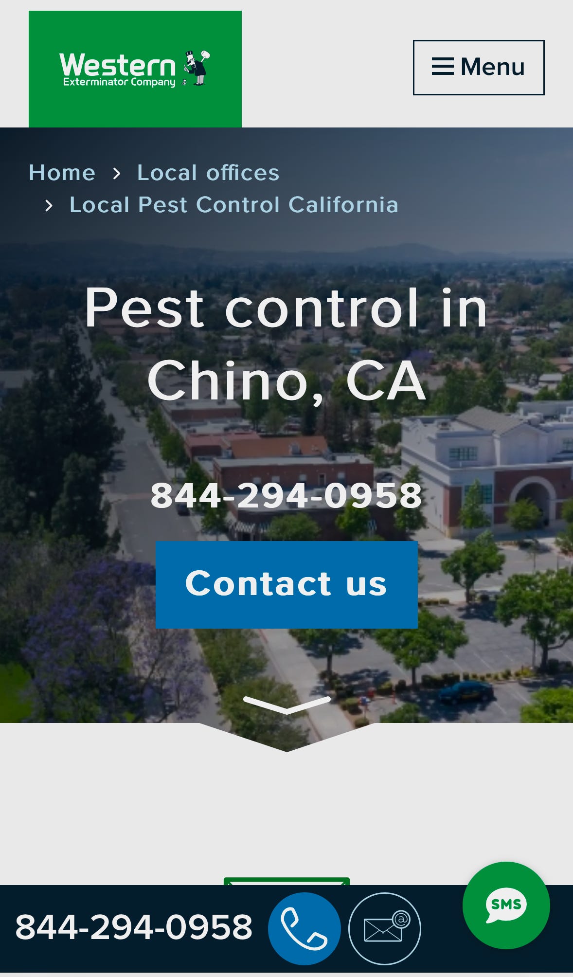
For example, on a local businesses site, it’s really common to see them using hero images that are just way too large.
The above example shows how they aren’t using their above-the-fold space to its full advantage. If this is the first page I land on as a user, I’m not immediately convinced that I should scroll down for more information. Instead I’m bombarded with 6 different call to actions and a giant image of the city I live in.
There isn’t any convincing information.
How to Create Above-the-Fold Content That Converts
There are some elements of the above-the-fold content that you should pay special attention to so you can earn that scroll:
Hero image
Headlines (H1)
Subheadlines (H2)
Social proof
CTAs
Hero image
The example photo I included earlier shows a hero image that is way too large and taking up too much valuable space. It’s very important that your hero image is properly sized if you decide to use one.
In some cases, it might be best to remove the hero image altogether. This entirely depends on the type of page you are working on. If it’s a blog post, it could be a good test to see how removing a hero/featured image helps improve scroll depth and other user engagement metrics.
Headline (H1) and subheadline (H2)
For Western Exterminator, our H1 is “Pest control in Chino, CA.” It’s clear that they just hit their target keyword and left it as is. When writing your H1 you want to have a hook, address a pain point, and emphasize value. They also didn’t use an H2 or subheadline at all.
If I had the chance to fix the above-the-fold content for this page, I would rewrite the H1 to be something like “Fast, Reliable Pest Control in Chino—Same-Day Service Available!” And the subheadline can be “Western Exterminator solves your pest problems—fast and hassle-free. Call now for a free quote!”
This still includes their target keyword while letting users know who we are, what we offer, and what our unique selling point is.
Social proof
Social proof creates confidence, reducing hesitation and encouraging users to explore further. Users need proof that your claims are credible, so include:
Logos and Ratings: Show ratings from trusted platforms like your Google Business Profile, Yelp, etc
Testimonials
Call to action
Sometimes sites don’t include a call-to-action (CTA) above the fold. With our Western Exterminator example, we have way too many. We need to find a balance.
Your CTAs should be specific and compelling. Think of your CTA as the nudge that moves users from interest to action, so make the value clear.
You might want to try a stick navigation or CTA to see if this can be a way to offer users all the information they need when they first load the page, while not using up any more space above-the-fold.
Test Your Above-the-Fold Content
Optimizing above-the-fold content isn’t a “set-it-and-forget-it” task. Use user behavior data to guide your changes:
Heatmaps: Find out where users click and how far they scroll. If users miss critical content, reorganize your layout.
Session recordings: Watch how users interact with your page. Are they searching for information that’s buried too low?
Scroll depth: Are users even seeing your headline and CTA? If not, reduce unnecessary visuals or move important content higher.
Click data: Are users clicking non-interactive elements? These signals show confusion or frustration, fix them.
Take Action
Above-the-fold content is your site’s first impression—make it count. Small, strategic changes can lead to massive improvements in user engagement and conversions.
Audit your own above-the-fold section. Is it doing its job?
If you’ve optimized your above-the-fold recently, I’d love to hear your results!


